1. in what ways does
your media product use, develop or challenge forms and conventions of real
media products?
Conventions of
Thriller:
The Victim
The Threat
The Suspense
The Enigma
The Hero
The Villain
Our Thriller Makes use of all these conventions, beginning with
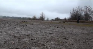
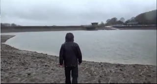
the protagonist as he is the one who first appears in our thriller. He first appears
at a reservoir where he attempts to get rid of this particular necklace that he
has been holding onto. We didn’t want to film this scene in a sort of cheerful
place…. Because of the current situation the protagonist is in, the weather and
the setting had to represent the feelings of the character. The character is
obviously not on top of the world; but more or less incredibly depressed or
upset. You could also call him somewhat of a victim also, but it depends on how
you interpret the scene. He is obviously troubled by the necklace pointing
towards what has been so bad about this necklace that he intends to throw it
away? We wanted to portray a sense of mystery to the protagonist as well. We don’t
exactly get a full reveal of the character until he lifts off his hood and
shows his face to the audience up until that point we wanted the audience to
think “what has he got to hide?” We later after the titles come to a scene in
which a group of characters including the protagonist are in a slightly lighter
and brighter setting than the one that they were previously in. We chose this
setting to divert from that sense of danger. The audience is meant to feel as if
nothing bad could happen in this place, obviously that all changes when we are introduced
to the main victim of the story who is killed without the audience knowing who
he was or anything about him for that matter. Once investigated by the group
they find he is carrying the same necklace that the main protagonist threw into
the water plus the same necklace that Amy (the female Character) is wearing,
This Leads towards our enigma:
-
Why did the Protagonist throw the necklace away?
-
Why did the protagonist get rid of it at that
specific place?
-
What connects the necklaces?
-
Why was the man shot?
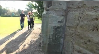
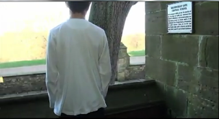
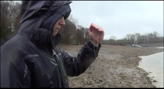 Shot 3: Here in this
shot we catch a glimpse of the main protagonist looking at the necklace and pondering
over what to do with it… this shot is the first time we see the necklace fully
and is can obviously be seen as some significance. I also like in this shot how
the protagonist twists his hand by looking at it… Giving him a quite menacing
feel.
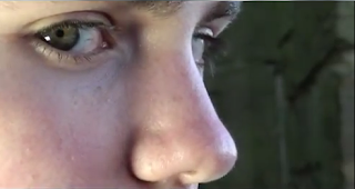 Shot 7: This is my favourite shot out of all of them, straight
after the previous shot we get an extreme close up of the man’s eyes slowly looking
towards the camera. Because the soundtrack continues on from the previous shot
it still carries on with this creepy tone making this hot that more threatening.
When he’s looking at the camera also; it’s
almost as if he’s looking at you which make this particular shot rather
uncomfortable when being watched. That’s why it’s my favourite shot.
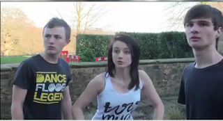
Shot 8: This shot comes after when the man is shot and the
characters have ducked as a reaction to it. This shot captures the
panic in the
characters faces when they’ve released what exactly just happened.
Shot 9: The final shot of our thriller in which we see a
close up shot of the necklace taken from the man’s hand as the two boys observe
it. Here you can hear the soundtrack leading off into the ending transition
giving off an evil presence towards this necklace.
2. How does your
media product represent particular social groups?
The Characters represented in the film are teenagers which
is also the age of the audience that we are aiming for. The Characters in this
film are also roughly the same age and easily get along with one another;
representing todays modern society of teenagers also. The Three teenagers in
scene 2 are also discussing the arrangements of a particular party that they
have created, teenagers often host evening parties and this could be seen as stereotypical
toward that age group. Scene 1 on the reservoir also suggests depression every
teenager goes through a stage of depression in some form or other and this is how
we chose to show that. For the reservoir scene We chose this particular day and
area because of the weather forecast for that day (which was rain) plus, the
particular setting we filmed in isn’t exactly a warm, sandy beach; we choses this
area because it looked gloomy representing the thoughts of our main protagonist.
3. What kind of media
institution might distribute your media product and why?

 Our Audience would be the teenage market 12-18 which
includes both the male and female market I believe that more males would see
the film due to its premise however it does include elements such as the
inclusion of female characters which would attract the female audience also. The
target for a distribution rating given by the BBFC (British board of film
classification) would preferably be a 12 rating for DVD. A common Marketing strategy
used in the distribution of movies is to normally achieve a 12 or a 12A rating
for their film, allowing more people to go and see it and therefore more income.
In Addition a 12A rating only applies towards cinema audiences whereas only the
12 certificate is given to DVD audiences restricting younger audiences from
seeing this film.
5. How did you
attract/address your audience?
We used the technique of word of mouth. We showed many friends
and relatives the film in the hopes that they would enjoy it and therefore show
their friends as well. For this we used social networking site Facebook. Plus
to upload the video we used YouTube, and we also uploaded the video on our blog
as well were all our data and information on the preliminary and the final
product goes. As you can see we wanted
to spread the word of our film production online as we knew that the online
community is the biggest community in the world. Because every Video feed goes
back to YouTube, anywhere you watch it the video will automatically get more
views, and more views means more attention for the film itself; more and more
people would see it
6. What have you
learnt about technologies from the process of constructing this product?
Many of the technologies that I used to create this film
were unfamiliar to me at the time, I knew what they were, I just had no idea
how to use them. I think that the big obstacle that was in my way were the iMacs,
just for the fact that for the majority of my life I had been using normal Microsoft
computers and had only just been introduced to an IMac when in work experience,
and before Media Studies it was the first and only time I had ever used them. And
it’s because of this that I found editing to be mainly the hardest part to get
used to. Because we were given the
programmes Final cut pro, Garage band and Adobe after Effects to edit my film
everything was entirely new to me, so it took a few lessons before I could get
up and running on the actual editing process. Using final cut pro was exceedingly
difficult… It was a bit of a step up from Windows Movie Maker which I had been
using to edit my films for the past few years. I think it was the introduction
to all these other features which other normal computers didn’t have which
stumped me. Yet going through them and learning what most of them did was informative
and taught me a lot about how iMacs were incredibly useful for editing. By
using these programmes I have gained more experience in using these types of machinery
and because of this it’ll be a whole lot easier to perform any other given
tasks on the iMac. Another big introduction for me was the lighting and
camerawork, up until this point I had no idea that you could not use only natural
light for filming and that there were a massive variety of lighting techniques
that you could use to create the illusion of natural light. Camerawork also opened up much more techniques
to use with filming; learning the different camera angles, sizes and rules
helped me to create a much better presentation for our film.
7. Looking back at
your preliminary task, what do you feel you have learned in the progression
from it to the full product?
Because the preliminary task was the build-up to the full
final product, it was obvious that much had changed since the creation of the
preliminary film. Firstly as we had to film strictly on location at Haywards
Heath College we did not have to go through the tiring process of choosing our
location like we did in building up to the full product. For example we filmed
our full product in Nyman’s gardens in which we had to first e-mail/phone the
managers and the people who worked there to see if we had permission to film at
the gardens. We also had to time it right so that we had enough time to film
there. Plus we had to use a load of notice signs to let people know that we
were film because it is illegal to film other people without their permission.
We did not have to do all of this whilst filming the preliminary as we had the
college permission already given to us to film on the campus. Another aspect that was different to our preliminary
was the importance of lighting. For our preliminary we only used natural light;
this was troublesome just for the fact that in one shot it would be light and
then in the next it would be darker. Whereas in the actual final product we
used a number of different lighting effects which we noticed made the final
product a much better quality film altogether. In addition something we definitely
improved on is the sound included in the film more noticeably on the Foley and non-diegetic
sound. Once our preliminary was created it had no non-diegetic sound, Foley or
any other addition to the sound from the camera… whereas in our final film
sound was a must and it created the suspense and thrill whilst adding to the
overall surroundings in the film. For instance footsteps, raindrops and other
snippets of Foley were added into the film to make it more realistic. We also inputted in different pieces of soundtrack
to build up tension and suspense.
